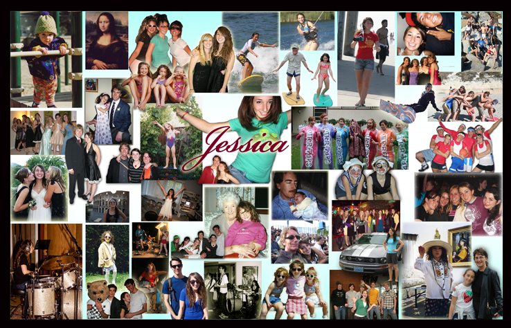
I think my best artwork this semester was the text & image artwork (second image) because it was one I really enjoyed, it wasn't like anything else I have done before and I was really happy with how it had turned out. Also, it felt good to give it to you as a gift because it was my favorite one out of everything I had done this semester.
An artwork I would like to redo is the first artwork we had done (first image) because I really like the ideas I had for it but I wasn't very impressed with the end result. I really like the concepts I was trying to show and I feel like a lot of it did not really come together how it should have so if I were to recreate this an artwork from this semester this would be the one I would love to recreate. Something I learned from this class this semester is to not procrastinate as much as I did. I think it is good to procrastinate once in awhile but in this class this year I let myself get really behind. So, in the future I will now know that I hated doing this to myself and therefore I am better prepared for college and life knowing that I highly disliked putting myself behind this much. One thing I wish I could have done in art this semester and in high school was screenprint a t-shirt, this is something I had never done but I had an idea I would have loved to do... maybe I can figure out how to do it on my own sometime soon!
0 Comments
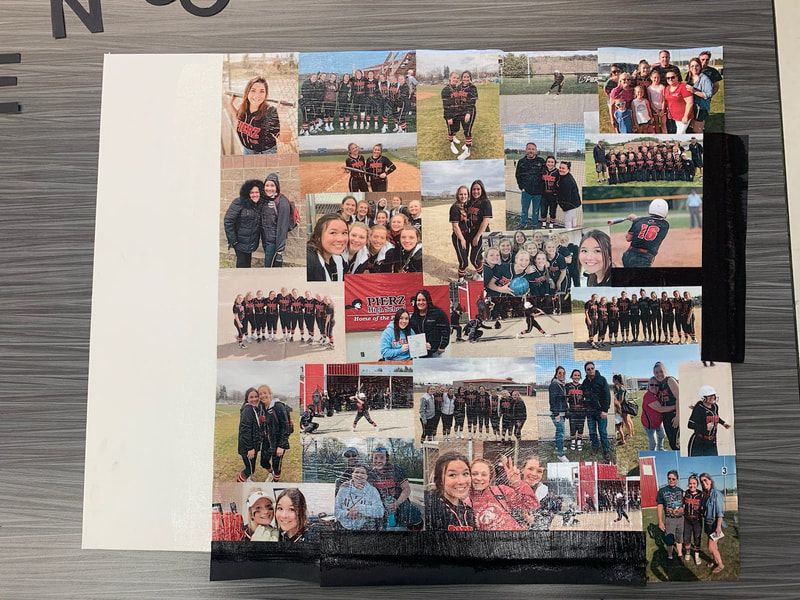
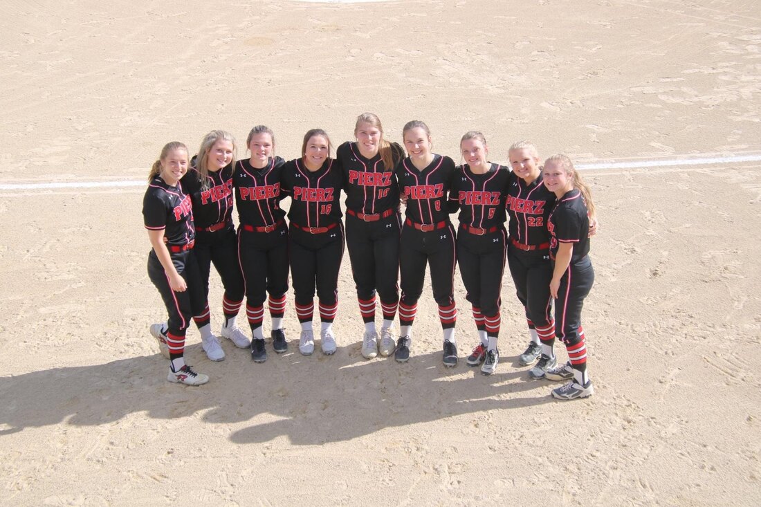
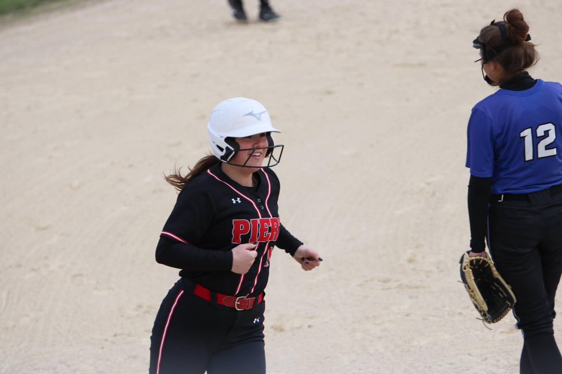
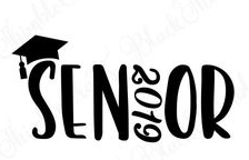
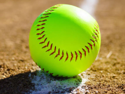
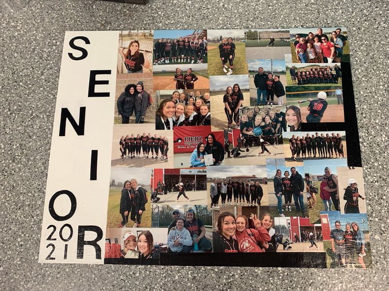 If I were to describe my artwork to someone who cannot see I would first explain to them my love for softball and the impact it has had on me. Next, I would tell them that there is a massive collage of a bunch of pictures taken throughout my senior season. Pictures with teammates, friends, parents, family members. Pictures taken outside of softball with the team, selfies and pictures of the nine seniors who were apart of the team this year. I would then tell them that on the left side there is the word "SENIOR" zig zagged in black letters with the year 2021 in the bottom left corner stacked on each other.
I created my artwork by first painting the left side white to have a base for the letters, then I mod podged down all of the pictures while trying to puzzle them in as best as possible. There were a few edges that pictures could not fit so I took black paper and used it to fill those blank spaces in. Lastly, I cut out the letters and numbers out of the same black paper and also mod podged those down to give the entire collage a glossy look and so it would all look the same. The big idea behind this artwork was to show my love for softball and to also have something to take with me as it is my last high school season. I wanted to show all of my friends, family and teammates who have supported me for years and I wanted to show the people who I can count on the most. My goals for this artwork to create a final project that I really want to keep and enjoy after graduating high school. This is something that I will keep for a long time because it shows some of the best memories I have made during my last months of high school. My other goals was to find a way to have the pictures all together in the best possible way without having extra spaces and not having to cover anyone up. Overall, I really loved this artwork, it was fun to look back at pictures from this last season and it brought up memories not only from softball this season but from all the way back when graduating was not right around the corner. I will miss seeing these girls every summer and high school season and I am excited to have an artwork that I can bring to college with me to look back at and remember all the exciting time I spent with the girls on this team, my family, my coaches and most of all the people I care about the most. Studio Habits:The first studio habit I have been using is observe. I have been observing how the different pictures collage together and looking at what looks best and how to place the photos together to make them look the best. The other habit I have been using is express. By collaging all of these images I am expressing my love for softball and how much I will miss playing in high school but I am also excited for new beginnings. Plans:My plans have stayed very consistent since starting this project and I have stuck to the same plan. My favorite part about this art is looking back at all of the pictures taken from this season so far, I love looking at them but at the same time it makes me sad to see it all be done so soon. I am still working on printing photos and mod podging them. I also have to paint on the side the word "SENIOR 2021" and then I will be done. Images:
Description Using Studio Habits:The first studio habits I am using for while planning for this artwork is envision. While planning this artwork I am envisioning what my final artwork will look like. I am thinking of possible ways to collage pictures and what they will look like. The other studio habit I am using while planning this artwork is engage & persist. This is because I have gone in to full senioritis mode and I do not want to do anything, so I am gathering my focus to engage in my artwork and to persist until it is finished. My overall goal with this artwork is to make a collage out of senior softball photos as something I can keep also because softball plays a huge part of my identity and with senior year ending I think it is fitting to create this. Images:
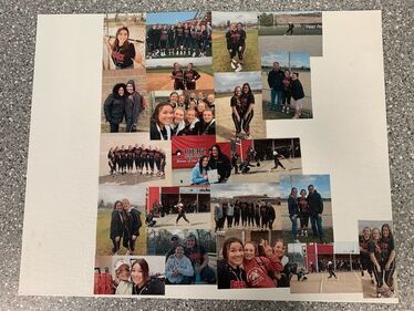
Process Photos and Finished Artwork:
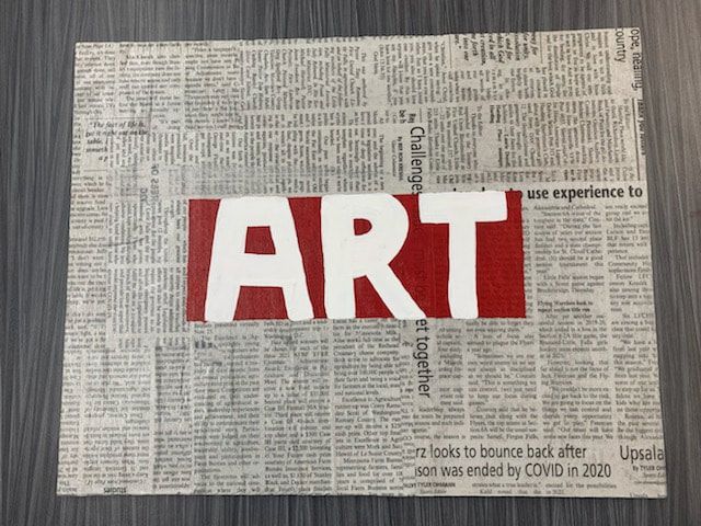
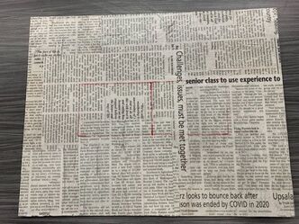
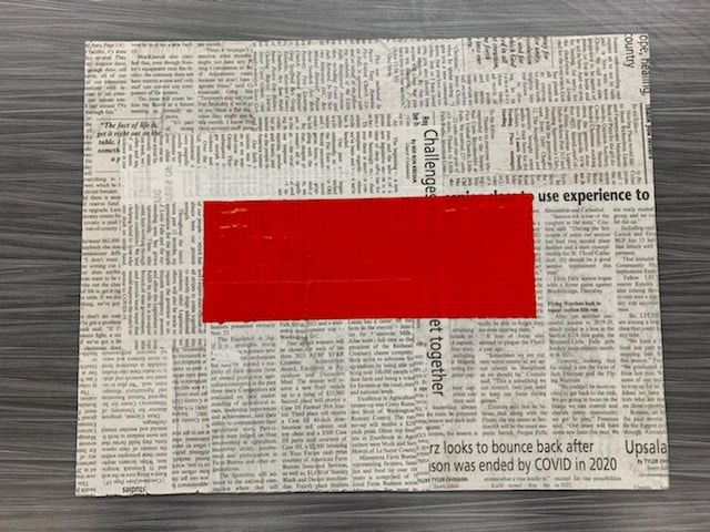
Artist Statement:If I were to describe this artwork to someone who could not see I would first share that the entire background is made of newspaper, next there is a red rectangle right in the middle of the newspaper background and it takes up a fair amount of space. The word "ART" painted on the rectangle, the word is white.
I created this artwork first by mod podging down newspaper, then I used red acrylic paint to paint the red rectangle and lastly I used white acrylic paint to paint the word "ART". Honestly there is no big idea with this artwork, I randomly thought it would be fun to make an artwork in a sarcastic way so I guess you could say this artwork represents a sort of sarcasm. My goals for this artwork were to get it done as quickly and neatly as possible while using text & image. I used text and image by using newspaper and the "ART" symbol represents text and an image. I needed to get this done quickly because while I was at home I did nothing but in the end it is all working out. Overall I really like this artwork, at first I was not sure how well it would turn out but it ended up turning out great and I really enjoyed how simple it was. The only challenge I had while working on this was when I taped off the rectangle it had taken some newspaper with it but I went and mod podged over it and you can hardly tell. Everything else went really smooth so there is not much to complain about and that is why I think it is successful. What Postmodern Principle?I have chosen to use the text & image postmodern art principle. I am showing it by mod podging newspaper for the background and then I plan to paint the word "ART" on the newspaper. Inspiration, Plans, Progress
Two Studio Art Habits:The first studio habit I am using while working on this art work is developing craft. I have never done something like this before so it is new to me, also I have not used mod podge in a really long time so it is a learning expierience. The other studio habit I am using is envision. I use envision by planning ahead and thinking about what the final artwork will look like.
Definitions: Appropriation: borrowing imagery from historical and mass media sources Recontextualization: positioning familiar imagery in relation to pictures, symbols or texts Juxtaposition: combining contrasting imagery in a way to create new meaning Hybridity: using multiple sources of media or blending of cultural sources Text & Image: creating meaning through combined texts and images Representin: creating imagery that proclaim an identity, has a voice The Gaze: drawing attention to familiar imagery, can use shading techniques Layering: overlapping and overlayering multiple images or other pieces to create a artwork Artwork Ideas:I plan on basing my artwork off of the postmodern art principle text & image. I have chosen text & image because I find it most appealing and I want to use some mod podge. I also have chosen this post modern art principle because I want to make something different than other artworks I have created before and I think I can do that with text & image. Two Examples of Text & Image:
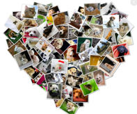
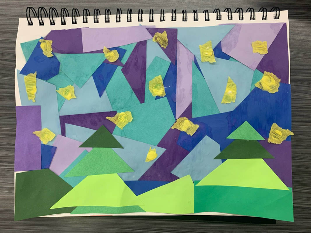
Create: Mixed Media Collage
Research:The 3 different collage artists I found were Nancy Spero, Jesse Treece and Hannah Hoch. I chose these 3 artists because of what they have in common. All artists use cut outs of magazines and images to create a collage artwork. I also noticed that in the collages I found from each that all three of them do not use much for color and mostly use black, white and the colors in between the two. The differences between each artist is that Nancy Spero bases her art off of political, social and cultural concerns. Jesse Treece uses images of children to create a collage based off of everyday life and Hannah Hoch based artworks off of racist and sexist codes mostly in Germany. Reflection:Overall I was happy with the collage I had created. I used regular colored paper for the majority of it and then yellow tissue paper for the stars. The only struggle/part I least enjoyed was cutting and glueing all of the pieces that were used for the background. Other than doing all of that this collage was really easy to make and I think it looks cool too. After looking at different artists I realized that collages can be about anything and can be made out of anything. It was interesting to see a bunch of collages that I would never think of and some were pretty crazy looking.
|
HalleI am a senior and I like sports and animals Archives
May 2021
Categories |


 RSS Feed
